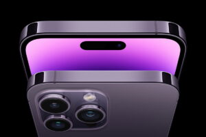
Apple introduced the Dynamic Island to the world with the announcement of the iPhone 14 Pro and Pro Max. And just like clockwork, copycats around the world – be they independent developers or large companies – have taken it upon themselves to do something similar for Android devices. Which is fine, to an extent because as they say, imitation is the greatest form of flattery. While there is some truth to that, there is something equally tragic about it all.
Because as brilliant an idea the Dynamic Island is on the software side of things, it is ultimately a pretty disguise for the two cutouts on the screen of the iPhone 14 Pro and Pro Max. The great software is the polish that’s being used to hide or doll up something that’s inherently hard on the eyes. And you know what they say about polishing a turd…

At this point, I should probably clarify what I mean by Dynamic Island being a “tragedy”. On its own, it’s pretty ingenious part of a phone’s software and can be useful even if phones one day manage to completely get rid of notches and cutouts. But right now? It is obviously meant to disguise the holes on the screen first and act as an actually useful feature second. So the Dynamic Island is a tragedy because it is both an innovative bit of tech, but also a symptom of a larger issue – notches.
It is probably fair to say that notches came about as an effort to reduce bezel thickness gone wrong. And the goal of reducing bezel sizes we can imagine to have at one point in time have been noble in nature, which is to reduce phone sizes, increase screen real estate, or even both.

The journey to eliminating bezels on smartphone screens has been a relatively long one, even if not necessarily meticulously documented. As bezels on the sides are virtually eliminated, the ones on the top and bottom remain. The former because of the front-facing camera and, more recently, the various biometric sensors used for unlocking the phone.
As for the latter, this was because of the home button on iPhones, and the three-button navigation set on Android devices. These went away pretty easily, as the home button on iOS is largely redundant other than for Touch ID, while Android’s three buttons are easily integrated into the display itself. And with that, the bottom bezel went away without much resistance.
Which is when things should have stopped. But no, we went ahead and took things too far instead.

At this point, all that’s left was the question: What can we do to eliminate the top bezel? In Apple’s infinite wisdom, it introduced the notch with the iPhone X as the answer, which led to other variants on the Android side of things – including punch hole cutouts. Some would say that they’ve learned to live with them, others would say that these have grown on them.
To begin with, did we ever really needed notches? Phones have went from having a pretty uniform 16:9 aspect ratio display to now being anything between 16:9 and 21:9, with many sitting at 2:1 (or 18:9, if you prefer). Which is why these days we see Android phones with display resolutions being rated as Full HD+, rather than just Full HD. The “plus” usually indicating that the screen is over 2000 pixels wide when holding phones in landscape view, while maintaining the 1920-pixel height. Notches have warped phone design in a way that adds another unnecessary variable into the equation.
It’s not like the extra screen space actually does anything meaningful. When you’re watching a video for example, all that extra real estate is unutilised, giving you two black bars on the sides. And when you do a reverse pinch gesture to fill the screen out, you’re then depriving yourself of the top and bottom edges of content. That’s not counting whatever bits of content the notch or cutouts obscure.

One can make the argument that the home screen can benefit from the extra space, which is fair. But on the flip side, were phone screens ever too small that notches become the preferable alternative? The notch didn’t save the mini iPhones from doom, so the answer is probably no.
So to answer the question of did we need notches, the answer is no. And to be honest, I don’t see why the alternative is so unappealing that we’re living with this.
What are these alternatives that I’m talking about? Current-generation Sony Xperia devices come to mind. If you really want the extra horizontal space for landscape content, then the 21:9 aspect ratio is an easier standard for developers and content creators to cater to, rather than any random ratio in between that and the more common 16:9.

All that being said, the aspect ratio is pretty irrelevant. What is relevant here is the fact that it also maintains small top and bottom bezels. The former to fit the front facing camera and its assortment of sensors, and the latter for the front facing bottom speaker for a standalone stereo experience. This is also something that some gaming phones, like the ASUS ROG Phone 6, do. And the uniformity is, in my eyes at least, much more preferable to a pretend bezel-less phone with a notch or cutout, which defeats the purpose of a full-screen body to begin with.
One alternative that many phone makers are currently working on (but can’t quite get right at the moment), are under-display cameras. But because this severely affects front-facing camera quality, it’s a no-go until the tech improves.

Another option is to use micro camera tech, something that Sony is currently developing. The idea is to use cameras small enough to be squeezed into what little bezel there is left. But because smaller cameras mean less light going through, which leads to inherently poorer image quality. This is remedied by using multiple cameras so that the images that they take can be synthesised into one, potentially lead to better shots. All that being said, the tech is still being developed and therefore is about as untested as can be.
So, with two potential solutions still needing more time in the oven, the only viable one left is to accept some bezels – with the additional benefit of stereo speakers. At the risk of sounding like a broken record, I wonder if this is really worse than having a notch?

One day, when the notch finally goes away, we can celebrate the Dynamic Island as the great idea that it is. Sure, most of the things it does are already accessible from the notification drawer on Android, but perhaps it can benefit from a more modern touch. But until then, it will always serve as a reminder that either phone makers or phone users prefer holes in their screens, which may or may not be a reflection of something else.
And on that bombshell…
The post Opinion: The Inevitable Fad That Is Dynamic Island appeared first on Lowyat.NET.